ShopDreamUp AI ArtDreamUp
Deviation Actions


Description
So I have this book. It's called 'Fantasy Genesis'. I HIGHLY RECOMMEND THIS TO EVERYONE. Everyone. Everywhere. I never would've drawn this without this book.
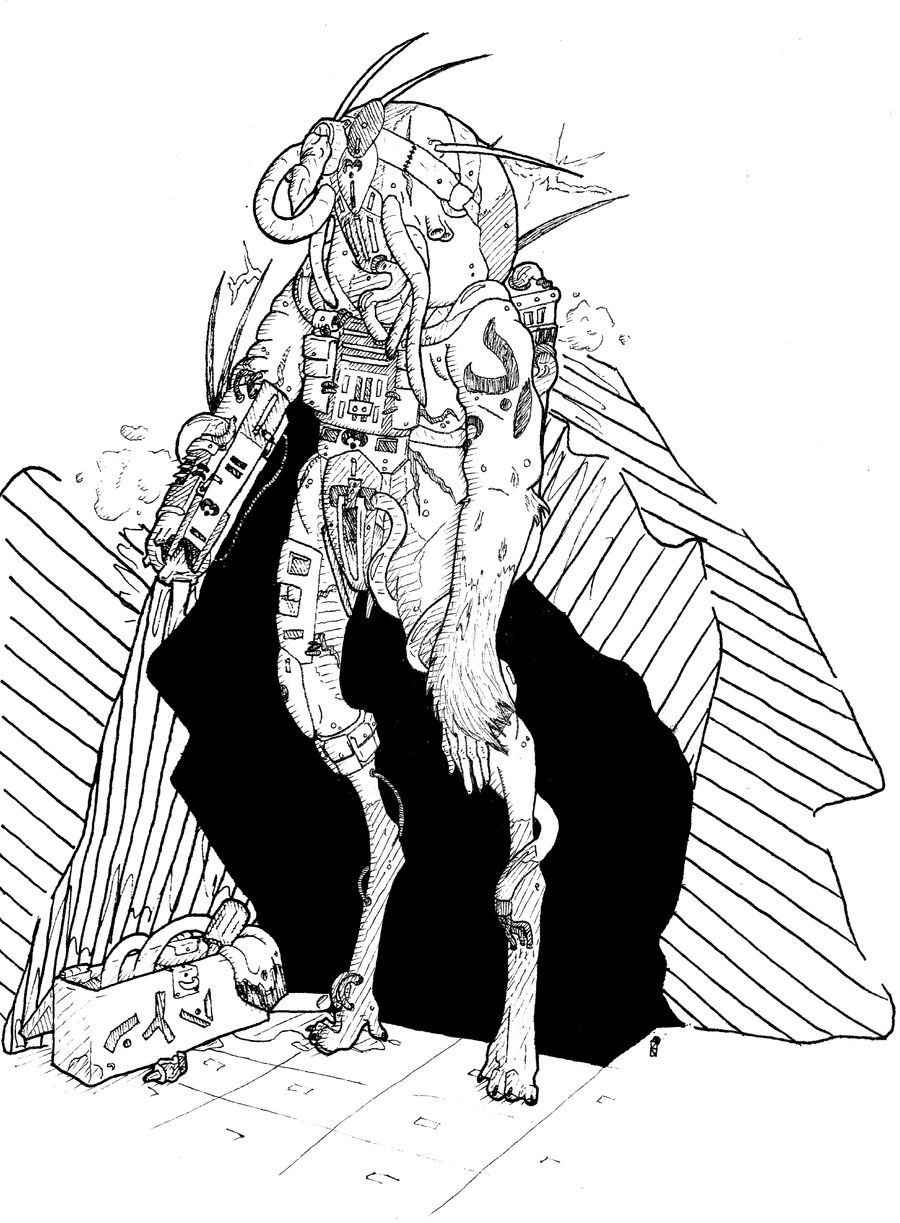
I love the look of sciffy, spacey, techy, biomech stuff. Always have. But you'd never know it from my gallery because I've never had any 'good' ideas for it.
I started rolling the dice (that's what you do with this book, it's like rolling an rpg character) and of what I rolled, these are what inspired this: Octopus; Primate; Lupine; Palm (tree); Electric bolt; Vapor; Reactor core; Laser beam; Stitch
With that amalgamation of items, creatures and concepts I give you the biomechanical lupine cephaloid sapien soldier!
Image size
3985x5414px 1.25 MB
© 2011 - 2024 lionsilverwolf
Comments21
Join the community to add your comment. Already a deviant? Log In
Hey there!  I'm here on behalf of #Traditional-Artists to make sure you get all the feedback this piece gained at our last Critique Night!
I hope it is helpful and you can use it for your future work! (Smile)")
 By *pixie-queen:
“The first thing which struck me about this piece was the immediate sense of pattern. The juxtaposition of different patterns is really interesting. The mechanical quality of the figure made up of so many different parts works so well.
I love the line art quality and the dark space behind the figure which makes it stand out. Also, the fact that the mark-making isn't all the same size, that the pen tip is thinner in some areas works really well. The perspective on the floor looks realistic, even though there's not much needed it just adds that little extra sense of space.
Can't actually think of anything to add to this, it's a great piece and a really nice style.”
By *Dalal-N:
“What a gorgeous and detailed piece! My only qualm with it is that the black is very strong. It draws the eye away from the detail of the upper body (if body is the right word) and down to the legs, which are less detailed. I'd suggest either using the black more sparsely or balancing it with more black elsewhere.”
By ~ayjaja:
“Oh, this piece is really good! The mix of techno-staff, the details of the human body and the animal body in one figure heats the imagination. It's really original idea. And the outline is so sophisticated.”
By *KW-Scott:
“I like this piece I think it took a very good imagination to come up with such a creature. The stark black is a bit distracting I think it should be either more of it or less of it.. perhaps graduated instead of so crisp... Overall this is a good composition and a nicely detailed drawing of an unusual creature .”
By ~Saiyajin-hime:
“A very interesting idea and design, it's very creative and I love the intricate details on the machine parts. The only critique I have to offer on this one would be to add more shading to the background, it's too blank as it is and doesn't really go well with the rest of the drawing. Overall it's great.”
By ~GAMIART:
“It is always nice to see a black and white traditional drawing that has no stray pencil marks. I like the imagination of the piece it is certainly not something you see every day. The inking seems to be very well done. When I first saw it I thought l was looking at a page in a comic book. I also love how the artist was able to flow change his inking style making parts of the body look like skin while another part looks like real machinery.”
By =ziinyu:
“I love the detail work and illustrative feel of this piece. The line is organic and the variance in it creates a wonderful textural quality. However, while the aesthetic is appealing on a cursory glance, many things make it very difficult to read as a character.
By far the most striking element of this piece is the silhouette effect created by the black backdrop. Why? - because it isolates a unique and recognizable shape. It is much easier for us to interpret a distinct shape, than it is to search for a shape amid a collection of lines. Within the body of the figure it takes a while to orient the limbs and elements because we can't recognize them quickly, it's too "busy". This isn't to say that the detail is a bad thing, it's great that there is so much to look for, but we have to be able to read the character first.
So, take your line quality, your hatching, and your tone - and use it to intentionally create a hierarchy of importance. Increase the weight of the lines around the most important features (things like separating the arm from the figure, or distinguishing the larger mechanical elements from the organic ones). Get a little more variety in the depth of your hatching, right now you pretty much have black, white, and a few versions of very light hatching. Get some more elements on the dark side of things - use this darkness to push back things that are further away. Create a tone thumbnail for your figure, no larger than 2" × 2" - no detail, just play with line weight and hatching depth. Once you get a readable thumbnail, apply those properties to the actual image and add detail on top of that. Your final image from a distance should still read the same as your thumbnail.”


I hope it is helpful and you can use it for your future work!
“The first thing which struck me about this piece was the immediate sense of pattern. The juxtaposition of different patterns is really interesting. The mechanical quality of the figure made up of so many different parts works so well.
I love the line art quality and the dark space behind the figure which makes it stand out. Also, the fact that the mark-making isn't all the same size, that the pen tip is thinner in some areas works really well. The perspective on the floor looks realistic, even though there's not much needed it just adds that little extra sense of space.
Can't actually think of anything to add to this, it's a great piece and a really nice style.”
“What a gorgeous and detailed piece! My only qualm with it is that the black is very strong. It draws the eye away from the detail of the upper body (if body is the right word) and down to the legs, which are less detailed. I'd suggest either using the black more sparsely or balancing it with more black elsewhere.”
“Oh, this piece is really good! The mix of techno-staff, the details of the human body and the animal body in one figure heats the imagination. It's really original idea. And the outline is so sophisticated.”
“I like this piece I think it took a very good imagination to come up with such a creature. The stark black is a bit distracting I think it should be either more of it or less of it.. perhaps graduated instead of so crisp... Overall this is a good composition and a nicely detailed drawing of an unusual creature .”
“A very interesting idea and design, it's very creative and I love the intricate details on the machine parts. The only critique I have to offer on this one would be to add more shading to the background, it's too blank as it is and doesn't really go well with the rest of the drawing. Overall it's great.”
“It is always nice to see a black and white traditional drawing that has no stray pencil marks. I like the imagination of the piece it is certainly not something you see every day. The inking seems to be very well done. When I first saw it I thought l was looking at a page in a comic book. I also love how the artist was able to flow change his inking style making parts of the body look like skin while another part looks like real machinery.”
“I love the detail work and illustrative feel of this piece. The line is organic and the variance in it creates a wonderful textural quality. However, while the aesthetic is appealing on a cursory glance, many things make it very difficult to read as a character.
By far the most striking element of this piece is the silhouette effect created by the black backdrop. Why? - because it isolates a unique and recognizable shape. It is much easier for us to interpret a distinct shape, than it is to search for a shape amid a collection of lines. Within the body of the figure it takes a while to orient the limbs and elements because we can't recognize them quickly, it's too "busy". This isn't to say that the detail is a bad thing, it's great that there is so much to look for, but we have to be able to read the character first.
So, take your line quality, your hatching, and your tone - and use it to intentionally create a hierarchy of importance. Increase the weight of the lines around the most important features (things like separating the arm from the figure, or distinguishing the larger mechanical elements from the organic ones). Get a little more variety in the depth of your hatching, right now you pretty much have black, white, and a few versions of very light hatching. Get some more elements on the dark side of things - use this darkness to push back things that are further away. Create a tone thumbnail for your figure, no larger than 2" × 2" - no detail, just play with line weight and hatching depth. Once you get a readable thumbnail, apply those properties to the actual image and add detail on top of that. Your final image from a distance should still read the same as your thumbnail.”